The website of a company is often the first contact between a potential customer and the brand. So it is crucial to have a landpage that stands out and captivates people’s attention. Even in terms of SEO, it is detrimental to the site that visitors come and go in no time. Let’s show you some good examples of creative and successful landpages.
Lyft
This website that allows drivers to give rides to passengers through an app has a perfect landing page. It immediately offers a sign-up form without having to hunt around for it or being taken to another page. It also allows those who are interested in participating to find out how much they can earn by typing in the number of hours/week they’re available to drive and the city they’re located in. It pretty much puts the most pressing information right on the landing page, making for better conversions and better business.
Trulia
Anyone interested in selling their home can go to this site and get a personalized estimate. Their landing page asks for your address so they can get started on the estimate right away. No hunting around or sending messages or sign-up forms. Clean and simple.
Their landing page ploy is to get people to sign up, so that part is front and center. But they also offer a different “teaser” every time such, such as “He used Pinterest to discover a hidden London” sparking visitors curiosity and interest in how they might be able to make use of Pinterest.
Apple
Apple is known for getting its marketing right and its landing page is no exception. They always feature their newest, coolest product, wowing viewers with stunning images and luring them to click to see what other products this brand has to offer.
Airbnb
This site gets you caught up in the thrill of traveling by bombarding you with images of cool places, experiences and homes that are available. Their focus on traveling local-style makes you want to book a stay today.
Bills.com
Another example of cutting right to the chase, this website has a sliding scale right smack in the middle of their landing page that allows you to adjust it to the amount of debt you have. Interactive and useful to anyone directed to that site.
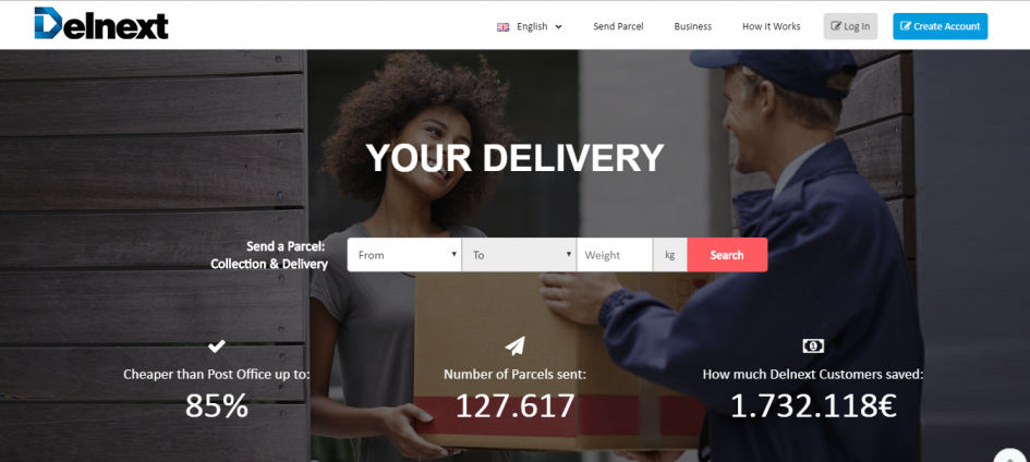
Delnext
Our company has a landpage where in a few clicks, and in a short time, you can get a quote for sending one or more orders from Portugal, Spain or Italy to any country in the European Union. In less than 5 minutes you can have multiple shipments scheduled.
LS Productions
As soon as viewers click on the page, they get a video loop of stunning shots of Scotland. For anyone wanting to use Scotland’s brilliant scenery as a backdrop for an ad, film or other project, their landing page shows you how amazing it will be.
Resn
This is a truly unique landing page. The prismatic drop in the middle of the page has a simple instruction which is to click and hold in order to catch glimpses of the company’s enigmatic and quirky world. Symbols at the top and bottom right hand corner will take you to other pages where you can understand more about their services if the landing page has compelled you to look more deeply.
The Professional Wingman
This site that coaches bachelors and single women on finding relationships shows you a progress bar at 50%, meaning that just by checking out their site, you’re halfway to the relationship of your dream.
Tracy Blanchard
Latest posts by Tracy Blanchard (see all)
- Top 10 Creative Marketing Viral Videos - June 21, 2017
- 10 Wonderful Examples of Creative Landpages - June 2, 2017
- 10 Wonderful Examples of Stickers in Marketing - May 24, 2017

 English
 Português
 Español


