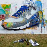
Have you ever come across a billboard that made you laugh, cry or go “Hmmm”. That’s what advertisers are aiming for when they design billboards. Here are our top ten pick of creative billboard ads:
1) Reebok
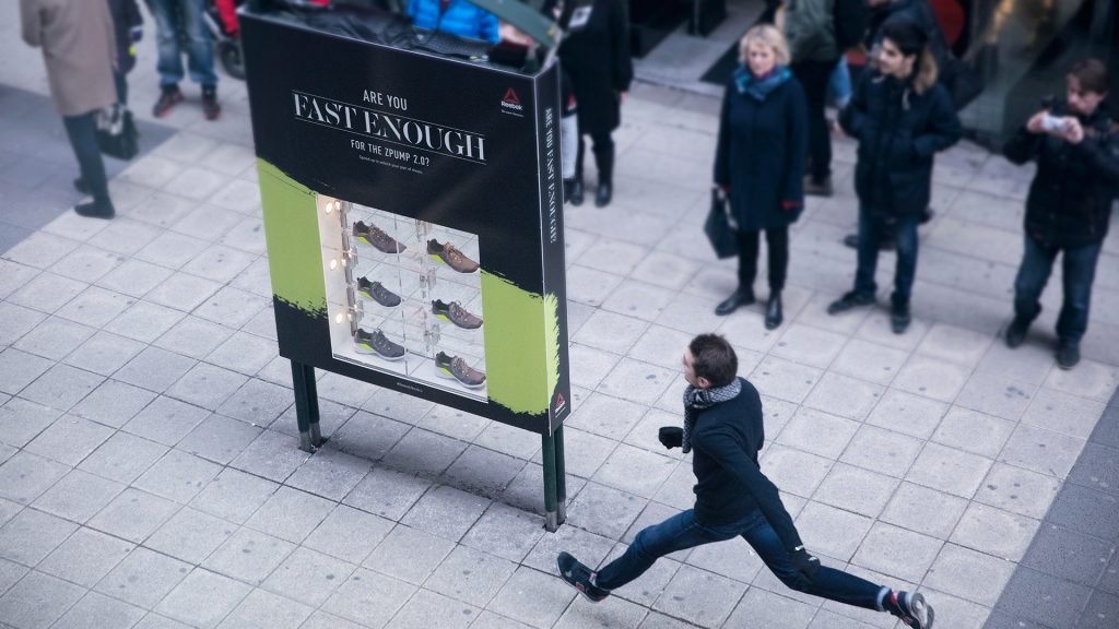
The athletic line Reebok wanted to stir up some excitement about their new running shoe, the ZPump 2.0. So, they set up an interactive billboard in downtown Stockholm asking passersby “Are You Fast Enough for the ZPump 2.0?” Participants were challenged to test their speed by running as fast as they could past the billboard. If they clocked in faster than 17 km/h, they won a new pair of ZPump 2.0’s.
2) British Airways
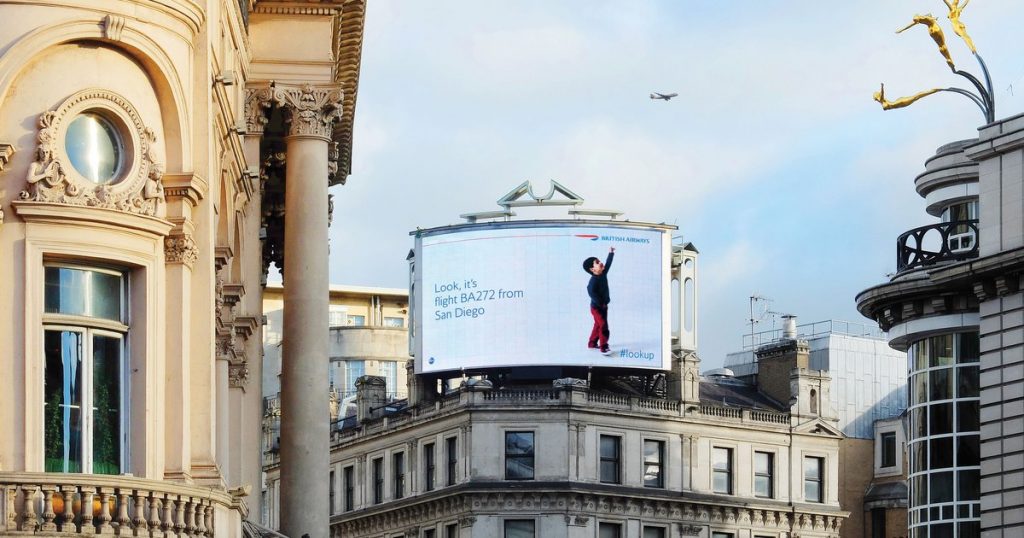
British Airways billboards used flight-tracking in real time to display flight arrival information in London’s Piccadilly Circus and Chiswick. Sounds boring, right? But the clincher is the child on the billboard pointing up with excitement as you hear the sound of a plane flying overhead.
3) Spotify
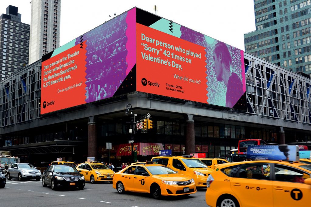
Spotify made waves with their super-localized billboard campaign: “Thanks 2016, it’s been weird.” They found unusual or locally relevant playlists that were created worldwide and broadcast them on billboards. In New York, their billboard read: “Dear person who played ‘Sorry’ 42 times on Valentine’s Day, What Did You Do?” And in London: “Dear 3,749 people who streamed ‘It’s the End of the World as We Know It’ the day of the Brexit Vote. Hang in There.” In addition to these cities, they also released billboards in 10 other cities worldwide.
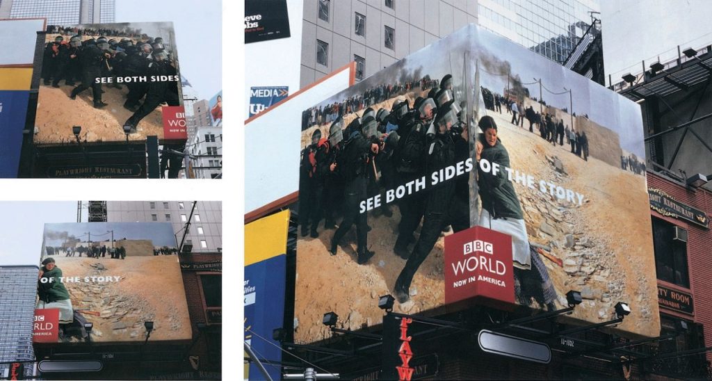
4) BBC World
BBDO New York mounted eye-catching billboards with images captured by photojournalists. The images were mounted so that they wrapped around a corner, allowing viewers to see the same image but with more information that changed the perspective of the viewer. The slogan? “See Both Sides of the Story”. Clever and effective.
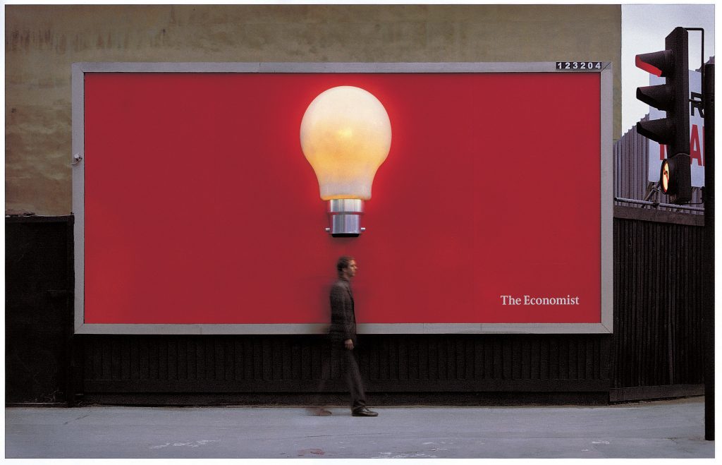
5) The Economist
Highlighting the magazines ability to spark dialogue and generate ideas, The Economist mounted billboards with a red background and a lightbulb in the middle of it. Whenever someone walks under the lightbulb, a motion detector causes the lightbulb to light up.
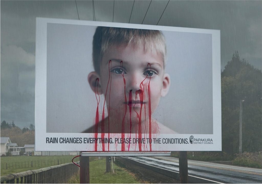
6) South Auckland
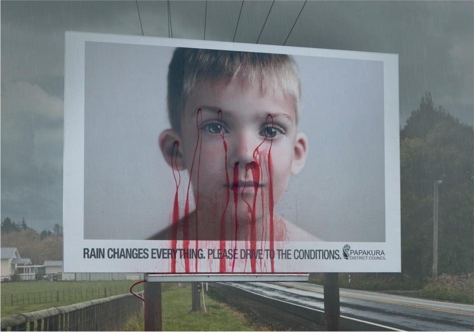
South Auckland officials wanted to create a billboard reminding people to slow down in dangerous driving conditions, particularly when it rains and the roads are slick. The aim was to reduce the number of fatal accidents. The billboard they mounted had the image of a child’s face that would become streaked with blood whenever it rained. The message: “Rain changes everything. Drive to the conditions” doesn’t speak as loudly as this powerful image.
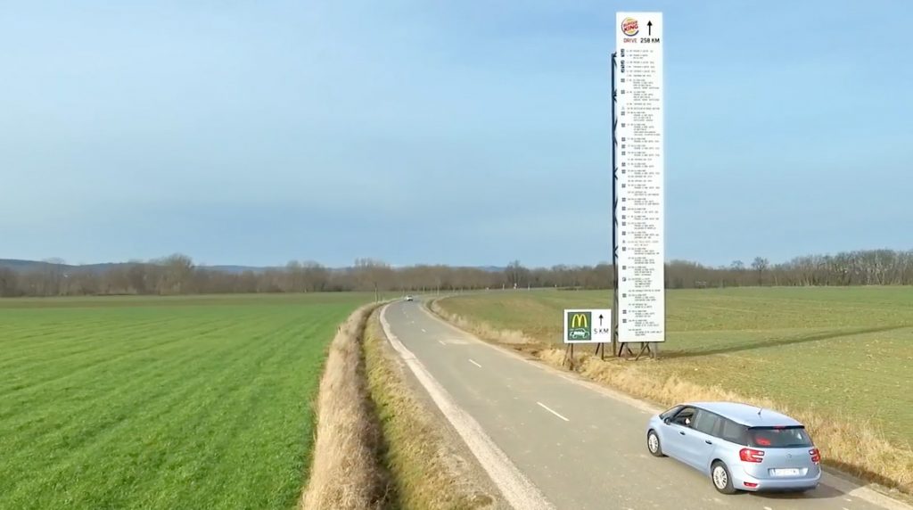
7) McDonald’s
In France, McDonald’s drive-thru restaurants are called McDrives. They placed two side-by-side billboards on the road near the town of Brioude. One of them is enormous, giving directions to the nearest Burger King with a drive-thru. The other, much smaller sign is for a McDrive, located nearby.
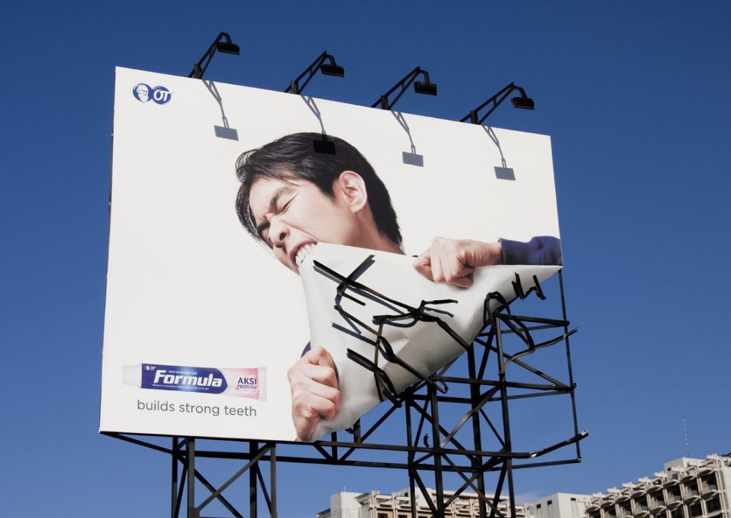
8) Formula Toothpaste
This billboard uses exaggeration to get their point across. It shows a man who has pulled half of the billboard up and is biting it between his teeth to show how strong this toothpaste can make your teeth.
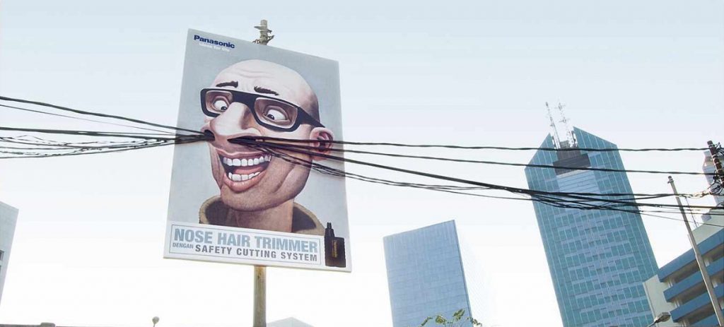
9) Panasonic
This billboard ad uses humor to highlight their product. Panasonic’s nose hair trimmer billboard features a man with very long nose hairs represented by actual electrical wires running along the street. Making your customers laugh is a definite plus in advertising.
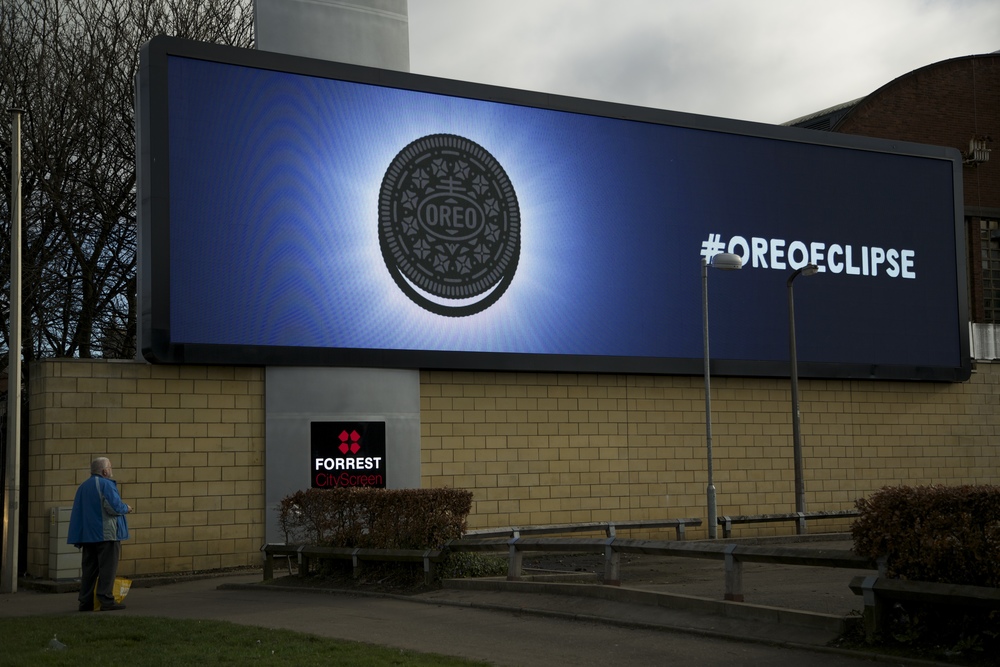
10) Oreo
They took advantage of the solar eclipse by creating a billboard ad that mimics the solar eclipse effect with an Oreo cookie. Linking actual events with your brand when it’s relevant is marketing paydirt.
Tracy Blanchard
Latest posts by Tracy Blanchard (see all)
- Top 10 Creative Marketing Viral Videos - June 21, 2017
- 10 Wonderful Examples of Creative Landpages - June 2, 2017
- 10 Wonderful Examples of Stickers in Marketing - May 24, 2017

 English
 Português
 Español